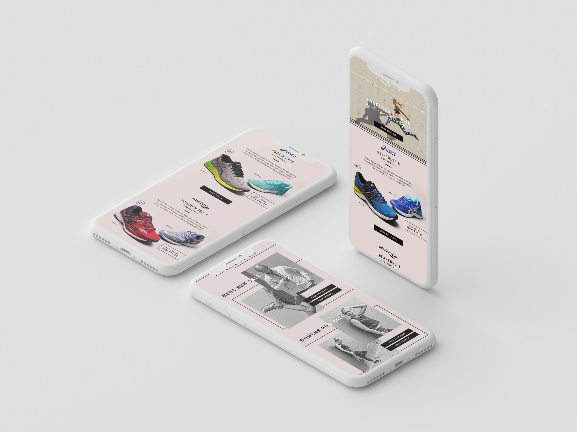
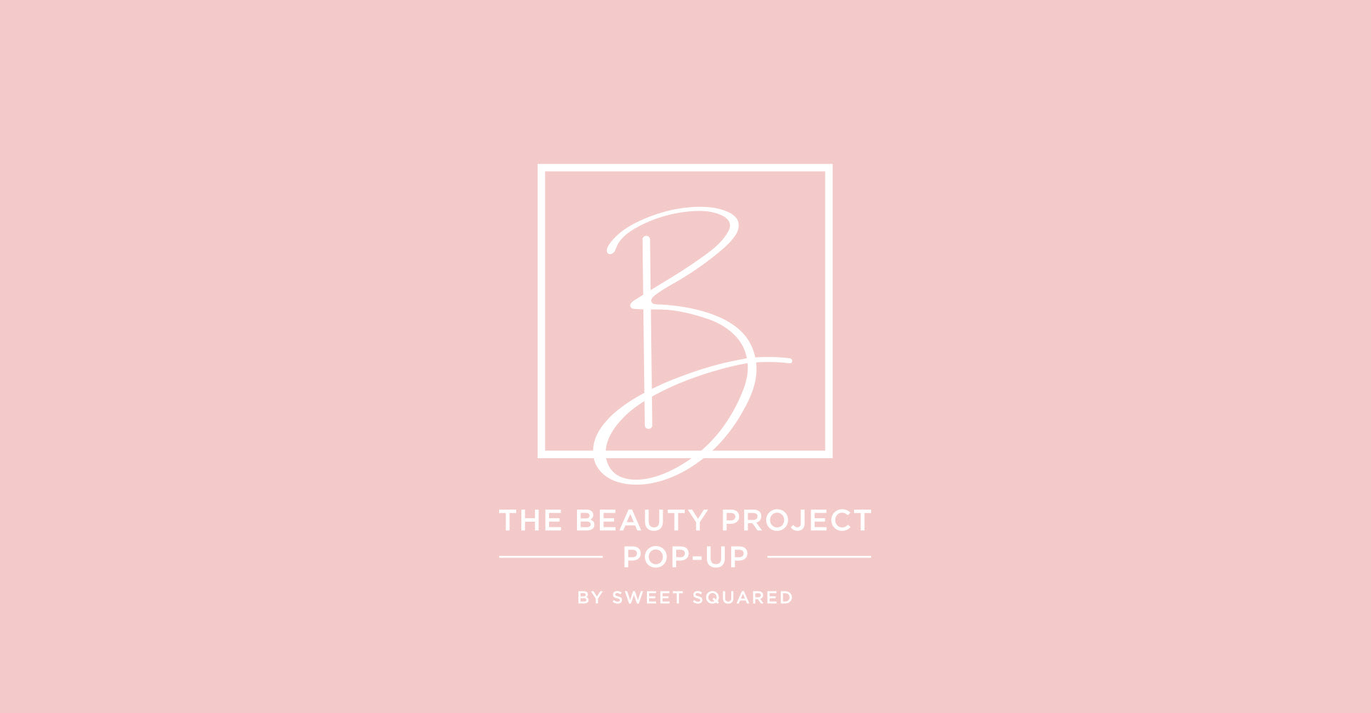


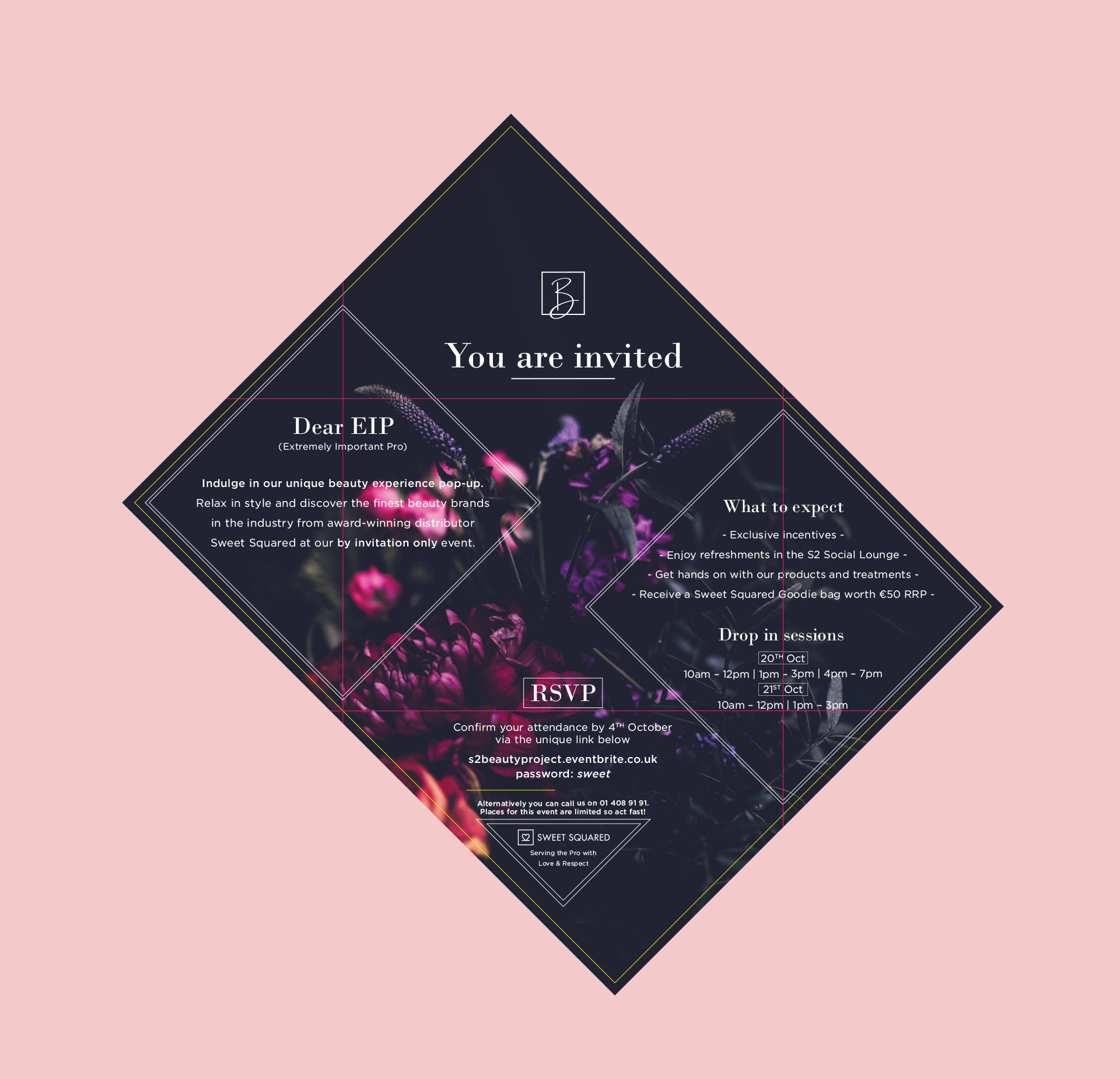
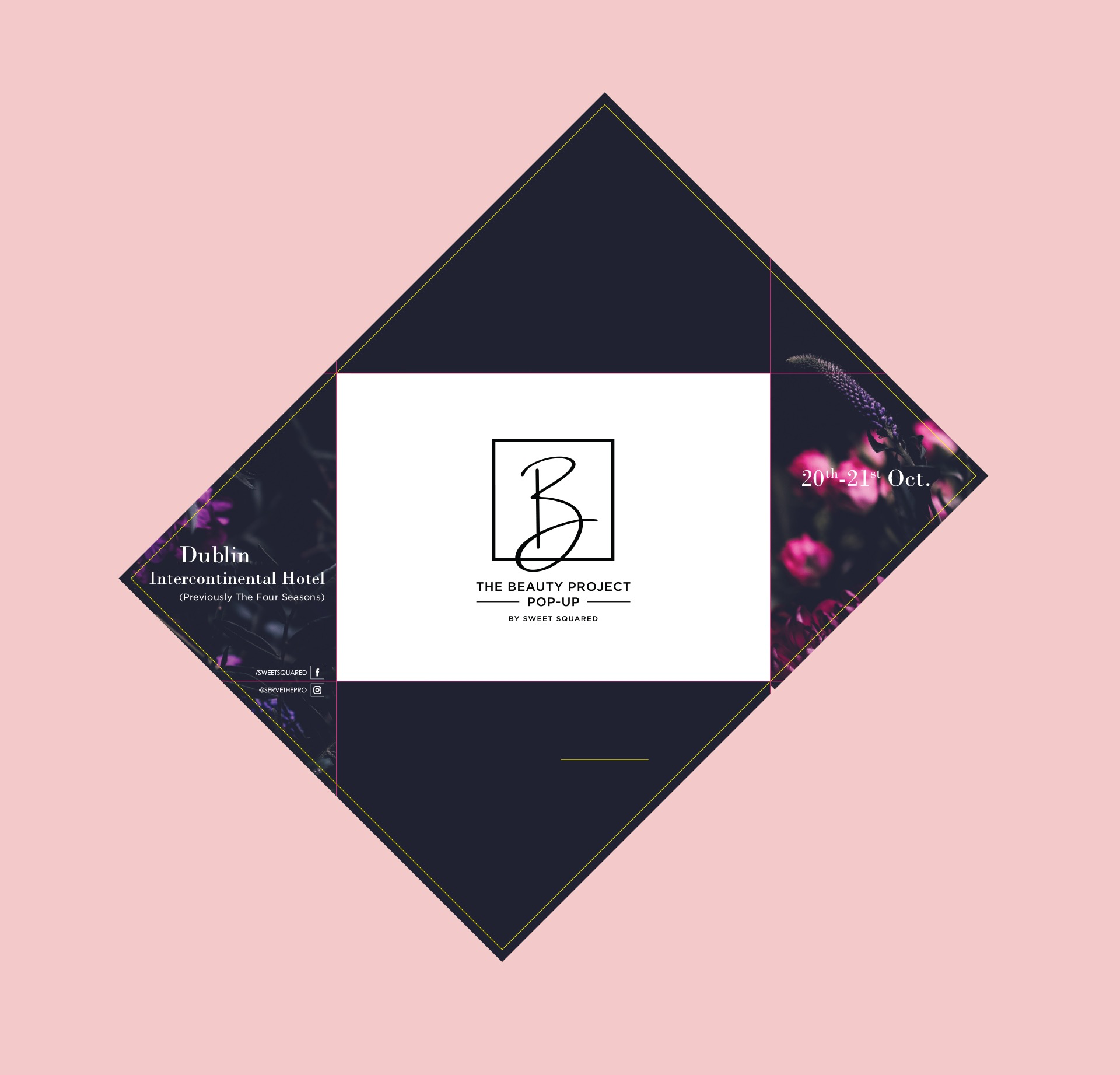
The Beauty Project invite
Following the success of the folding bridal bouquet flyer, I was asked to develop an invite for a new beauty exposition organised by Sweet Squared, titled The Beauty Project.
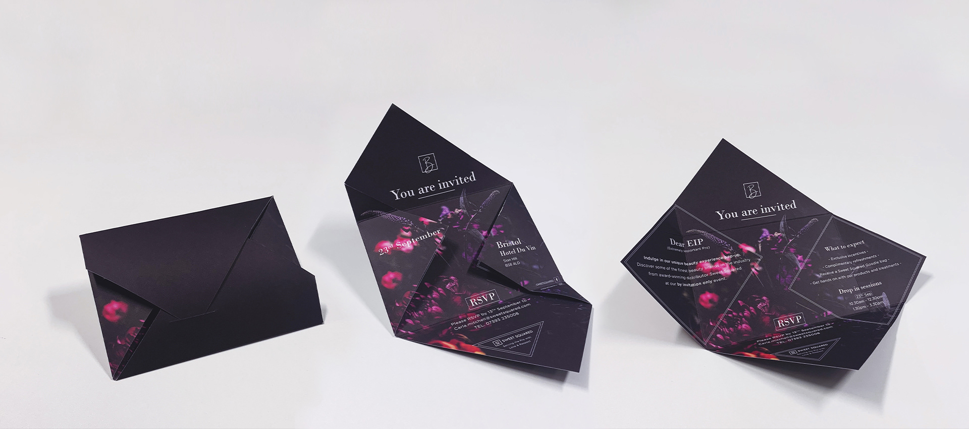
To create this folding invite, I rotated an A6 rectangle to 45° and placed it in the centre of an A4 artboard. I then folded each corner over the A6 sized rectangle so they meet in the middle.
I chose this design as its’ folding wings can neatly conceal information on the inside. When the left and right wing of the invite fold over they create a Z-shaped channel down the middle. This, I thought, would contain the monogram, key information and RSVP details whereas the fully unfolded design would reveal additional details about the event.
I laid down a floral background image and adjusted the background colour from black to a shade of navy blue so as to accompany Sweet Squared’s black brand colour. I then made the image seamless with the folds of the artwork.
Before finalising the artwork I had to create the monogram of the event. This was inspired by the square in Sweet Squared’s logo. I wanted the B to resemble a product swatch so I created a scriptive letter projecting from the square. The idea behind this was to symbolise the company branching out and thinking outside the box as well as emphasising that the event was a pop-up.
I placed the monogram over the top wing, central to the A6 shape in the middle, same with the RSVP details at the bottom and the key details on the outside of the wings. The use of shapes and dividers was sparing so as not to overload the offset design. After placing the additional info on the reverse of the left and right wing, I felt like I needed to outline either sides with two diamond shapes. I felt this complimented the design and outlined the Z-shaped channel.
I finished off the design by adding a slit to the bottom wing, where the top wing’s corner would slide into to keep the envelope closed.
Lastly, I chose a thicker, 200 GSM uncoated stock as it felt quite nice to the touch and also because a thicker stock would not allow the invite to lay flat. The reason for this was that I wanted to create an invite to a pop-up event, which looks like it is about to pop open.